

Project Team
UX and visual designer, project manager (me)
Designer, content writer
Content strategist and editor
Web developer
Spanish translator
Organizational managers
Methods used: UX audit, competitive analysis, content inventory, site mapping, sketching, wireframing, style guide
Tools used: Pen and paper, Adobe Illustrator, Adobe Photoshop
Project Duration: 18 months
Identifying the Problems
By 2015, a UX audit of the BIC U.S. website revealed it was facing a number of challenges:
Users found the variety of menus and layouts disorienting as they navigated the site.
Designed with a variety of brand guidelines, the site lacked visual cohesion.
The site lacked functionality for publishing articles that could be shared on social media, a strategic objective of the organization.
The infrastructure couldn’t accommodate custom translations needed to reach the organization’s growing Spanish-speaking constituency.
The site wasn’t responsive and hard to read on smaller screens.
Defining the Audience
The first step was to define our audience. Based on constituent feedback and analytics, we identified most of our users were unfamiliar with the BIC U.S. They were primarily seeking information about the denomination’s beliefs and looking for local churches to join.
Analyzing Competitors
The team reviewed and evaluated websites of several church denominations, noting the content they featured and the way they were organized as well as their visual appearance.
United Methodist Church

On the United Methodist’s find-a-church website, the team found the search and filter tools helpful as well as the location maps, service times, and contact information for each church.
Hillsong Church

Appealing to a younger audience, the team resonated with the clean layout and bold visuals of the Hillsong Church website.
Act’s 29

A blog covering a variety of topics, like on Acts 29’s website, appealed to the team as we sought a publishing platform for sharing stories on social media.
The Drawing Board: New Site Map, New Templates
After an in-depth review of content on the former website, we took to a blank whiteboard and drafted lists of pages that needed to be included as part of the new site, organizing them into a simplified sitemap.
Hindsight
While this content organization made sense to the project team at the time, we later received feedback from users that some things weren’t located where they expected. Doing this project over, I’d advocate for a user-based card sort to help us arrange our information more logically for users.
Pushing On
The writing team began their own process of researching and crafting content for each page of the new website. Meanwhile, the design team began sketching wireframes for the various page types.
Navigation

We landed on a navigation design that gave easy access to popular pages and made the rest of the expansive site accessible from an expandable menu. This approach created a consistent navigation experience throughout the redesigned site.
General Page

A basic template was needed for the majority of interior pages. Given its variety of uses, we kept the layout simple with a full-width photo across the top, main content area below, and in-section navigation in the right-hand sidebar.
Subsections
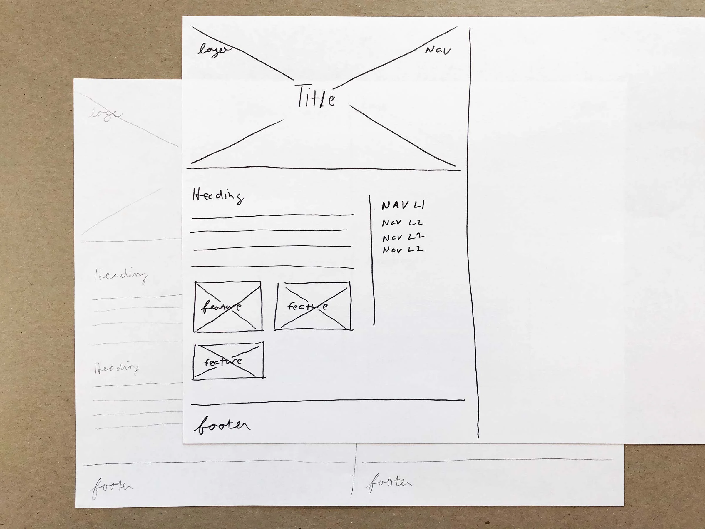
The new BIC U.S. website would include subsections for specific aspects of the organization. Given that, we created a “homepage” layout for introducing these sections in a consistent way.
Custom Layouts
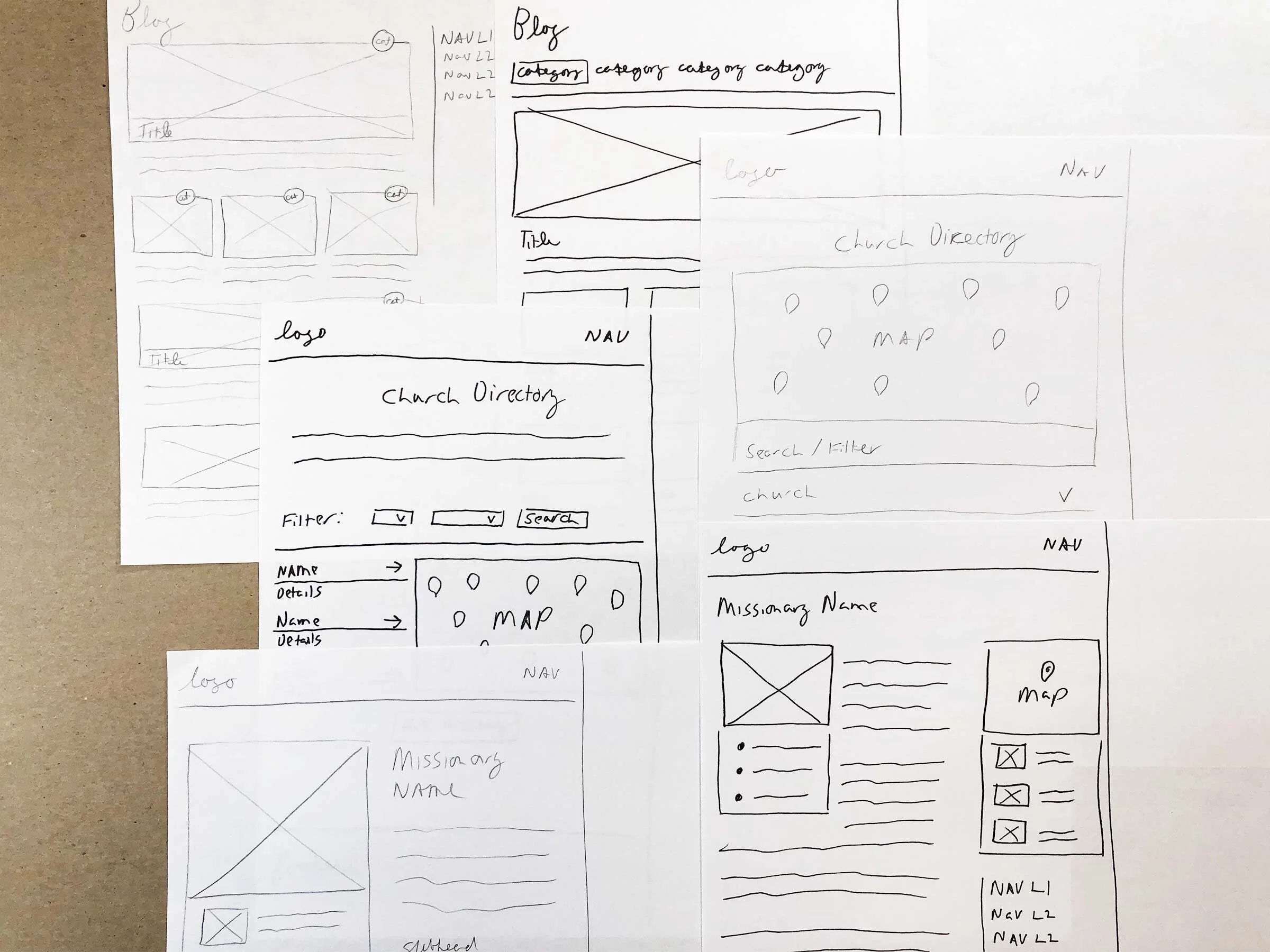
While the basic template met the needs of most interior pages, certain aspects such as the blog, missionary profile pages, and find-a-church feature, required more customized layouts.
From Sketch to Screen
The design team continued developing these wireframes, eventually handing off high-fidelity versions for development. Meanwhile the design, writing, and translation teams began their work of finding visuals, refining copy, and translating content for each page of the site. As these processes concluded, the site came to life in a tangible way.

For the home page, we used succinct, inviting language and prominently displayed popular site links.
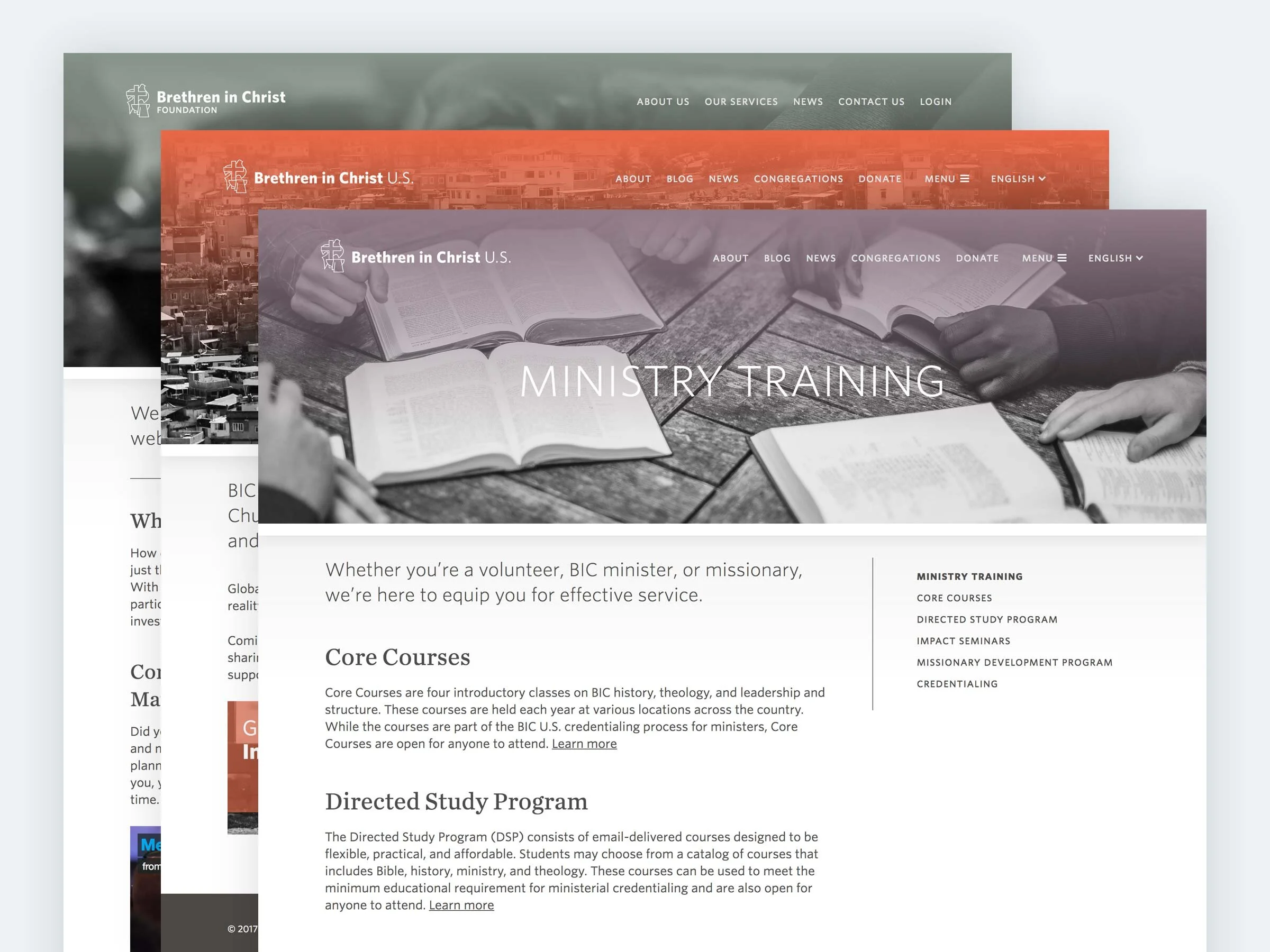
Color became an important factor in distinguishing subsections of the new BIC U.S. website, creating distinction within a cohesive design system.

Fully responsive and bilingual, the new BIC U.S. website was designed to accommodate English and Spanish readers on any device.

The new blog created a platform for telling stories and sharing resources with the BIC U.S. community, a strategic objective of the organization.

Enhanced tools gave users the ability to search and filter for a church within a geographic location and see details like average attendance for each option.
Bilingual Functionality
With a growing number of Spanish-speaking constituents, we needed a way to provide custom translations of the site’s nuanced content. The Polylang plugin for WordPress provided that functionality, allowing us to create English and Spanish versions of each page. Device and browser preferences auto-indicate which language users see while navigation menus let users switch languages if needed.
Feedback, Results, Final Thoughts
After launch, the new website received a variety of positive feedback from BIC U.S. constituents. For example, pastor Constain Carrillo said: “What an awesome job you guys have performed! Definitely more contemporary, versatile, and user-friendly. Bilingual! I love it!”
We were also thrilled with a few key metrics measuring how the new site compared with the previous site:
Pages per session increased by 40%
Average session duration increased by 48%
Bounce rate decreased by 15%
The team was thrilled to deliver a transformed web experience with functionality to match the needs of the organization.
Visit Site
See the BIC U.S. website live.
*Designed while employed by Brethren in Christ U.S.