

Project Team
UX and visual designer, project manager (me)
Product manager
Two content writers/editors
Web developer
Methods used: User and stakeholder interviews, competitive analysis, sketching, wireframing, mockups, user testing, style guide
Tools used: whiteboard, Adobe XD, Adobe Illustrator, Adobe Photoshop
Project duration: 8 months
Identifying Problems, Setting Goals
By 2018, the design and architecture of the existing Partnership Handbook website was showing its age, and we suspected users were having issues navigating the site.
Common issues identified through user and stakeholder interview:
No site guidance regarding which projects had the most pressing funding needs
Difficulty finding projects that matched donor’s personal interests
Project descriptions were difficult to access and didn’t clearly articulate goals
Funding progress information was misinterpreted
Difficulty using the platform on small devices
And while not a specific user complaint, the previous platform didn’t match the brand aesthetic of the parent organization.
Based on this feedback, and the reality of a dated platform, we set out to redesign the Partnership Handbook from the ground up with a goal of improving the experience for potential donors (site users).
Competitive Analysis
To help form a concept of how the redesigned Partnership Handbook might take shape, the team reviewed several fundraising platforms including GoFundMe, Kickstarter, World Vision’s gift catalog, Samaritan’s Purse gift catalog, and charity: water campaigns.
Campaign Overview Pages

GoFundMe and Kickstarter (not pictured) provided helpful information on their campaign list pages, giving users context at a glance. We also appreciated the simplified overview charity: water provided for each project.
Campaign Detail Pages

On campaign detail pages, GoFundMe and charity: water guide users with large images, sidebars with donation information, wide descriptions written in story-form, and strategically placed social media share links.
Brainstorming, Drafting, Sketching, Wireframing
With this inspiration and user feedback in mind, we began brainstorming content outlines for projects in the Partnership Handbook, asking ourselves: how can we make them more accessible and inspiring.
After landing on a new strategy, the editing team began revising content of existing projects and drafting a new application for future project submissions.
Meanwhile, I began incorporating these ideas into sketches, creating concepts for the new home and project detail pages.

I explored layout ideas for the home page that would best introduce the Partnership Handbook while inspiring and guiding first-time visitors. The initial concept incorporated a thumbnail grid of all projects.

Sketches of the project detail page explored the placement and organization of key elements.
The internal team provided feedback on these sketches, helping to refine and focus the design before I began creating higher fidelity wireframes which were later handed off for development.

Using team input to work from low to high fidelity, I created wireframes for the home, project list, and project detail pages.
I worked closely with the development team to address specific details and questions that surfaced as the site was becoming functional. For example, what would happen when the category list becomes too long for the filter bar? Placing these filters inside drop-down menus was a more flexible approach than the original design solution.
Decisions, Explained
The redesigned Partnership Handbook sought to alleviate user pain points and improve the overall site experience.
Home Page

At the top of the home page, it was important to highlight what makes the Partnership Handbook unique, making a case for why donations here are more impactful than elsewhere.
Project List Page

Category and location filters, alongside a search tool, help users find projects that match their interests while the project grid below gives users a way to quickly scan options. At the top, Priority Projects highlight the most pressing funding needs.
Project Detail Pages

Given the dynamic nature of some projects, we created an optional “alert” message for communicating time-sensitive project needs. In the sidebar, suggested amounts with brief descriptions give users context for how their donations could be used.

Project descriptions were written to clearly articulate project goals and inspire users to make a donation. For projects with defined financial goals, a “progress meter” helps track current funding status.
Correcting Course
Before launching the new Partnership Handbook site, user testing identified several issues with the donation sidebar.
Issue 1: In each sidebar, we introduced examples of how funds might be used (e.g., “$5 buys 1 chicken”). But users were under the impression their donations would supply exactly what the descriptions stated.
Solution: We added the subheading “Examples of Need” above the donation examples and added the conditional language “could buy” before each description.
Issue 2: Out of curiosity, users were clicking the donation suggestion boxes when, in fact, they were not interactive elements.
Solution: We removed the button-like boxes around donation suggestions, instead separating them with thin black lines.
Issue 3: A footnote above the “Give Now” button stated that donations of any amount benefit projects in the Partnership Handbook. However, most users overlooked this statement and felt restricted to contributing a pre-specified amount.
Solution: We re-wrote the footnote in a more succinct way and increased the size to add prominence.
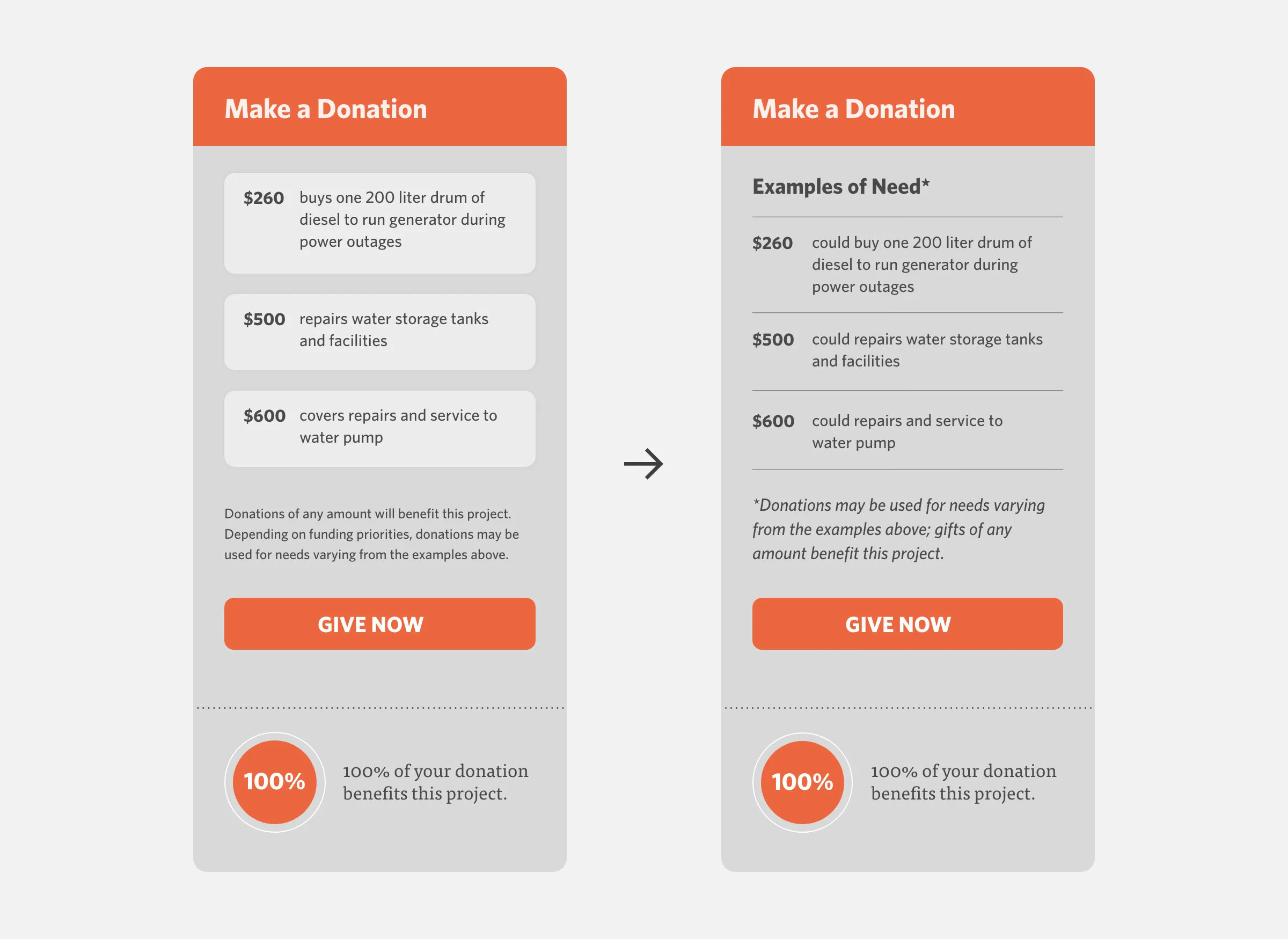
We redesigned the donation sidebar as the majority of user testers were misunderstanding the original design.
Lesson Learned
The timing of these user testing sessions, which happened late in the development cycle, wasn’t ideal. If tasked with doing this project again, I would advocate for getting design solutions in front of users sooner in the process to correct course before building began.
Results and Final Thoughts
When comparing the previous platform with the redesigned platform, we saw several significant improvements:
Number of sessions per user increased by 46%
Number of pages per session increased by 202%
Bounce rate decreased by 50%
The team was thrilled to deliver a well-received final product. Though still a work in progress, the redesigned Partnership Handbook website addresses the majority of challenges facing the previous platform and better meets the needs of its user base.
Visit Site
View the Partnership Handbook website live.
*Designed while employed by Brethren in Christ U.S.